

Design that speaks to a Billion 🇮🇳 | 4 lessons from Tarun Deep Girdher
Discover how the RTI and NOTA logos were crafted to unite a nation without losing meaning in the smallest village.

Happy 79th Independence Day everyone! In this special edition of TGP Samachar (#17) we will explore what designing for the government looks like vis a vis the experience of Tarun Deep Girdher in designing RTI and NOTA logo and more. ( ▶️ Ep.198 ). We have something special at the end, so stay tuned.
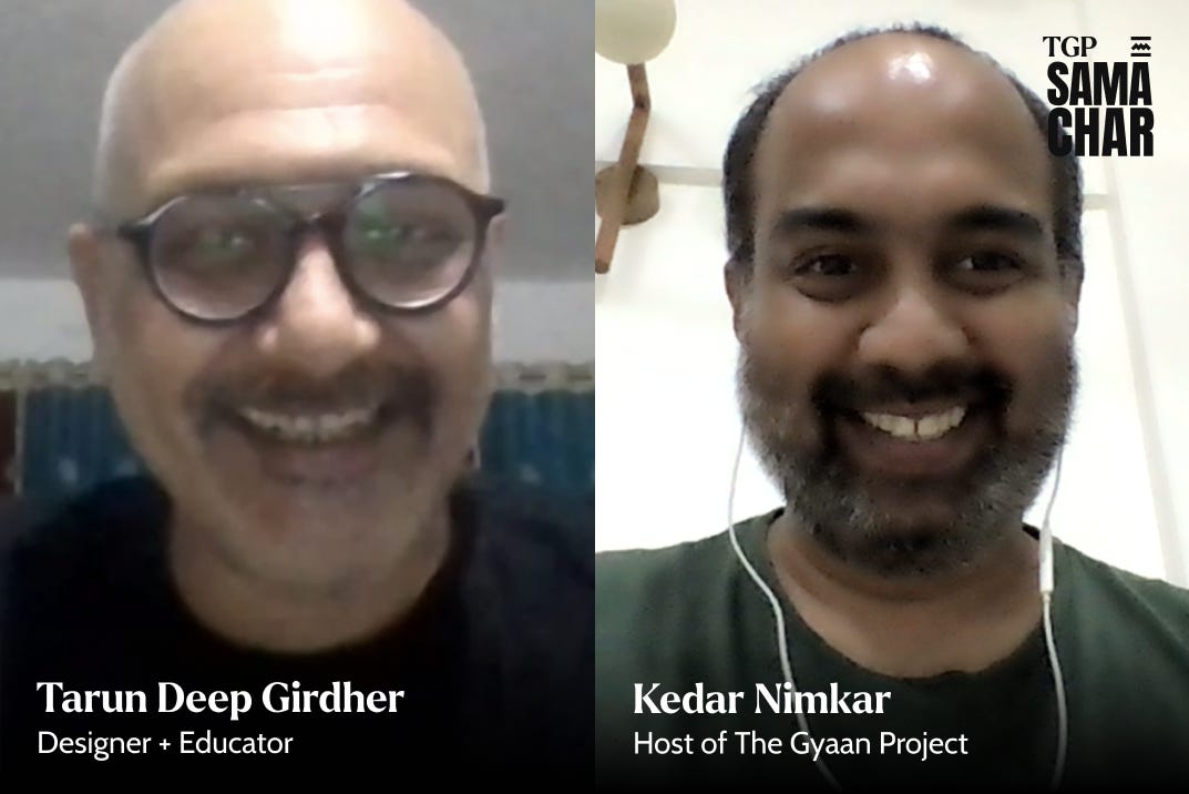
Tarun Deep Girdher serves as a Principal Faculty in Graphic Design at NID Ahmedabad. He is recognized for designing influential government logos, including the RTI ( Right to Information ) logo and NOTA ( None of the Above ) symbol, and for his extensive contributions to design education.

1️⃣ What's the main difference between designing for a government agency and a commercial company?
Short Answer: Survival.
Long Answer : I have observed that government agencies operate very differently from commercial companies. For a commercial company, a logo is a tool for survival. It needs to remain in the customer’s sight to create brand recall and associate with a product or service. For a government department, a logo is more like a face or an identifier. Whether people recognize a logo or not, doesn't necessarily influence the work of that ministry. Commercial logos work to sell and stay memorable, while government logos serve mainly to identify and represent authority.
What is your favorite GOI logo? Let us know in the comments 👇

2️⃣ What's the biggest challenge you faced with the RTI logo design?
Short Answer: Avoiding bad interpretations.
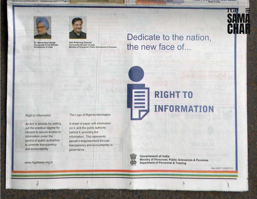
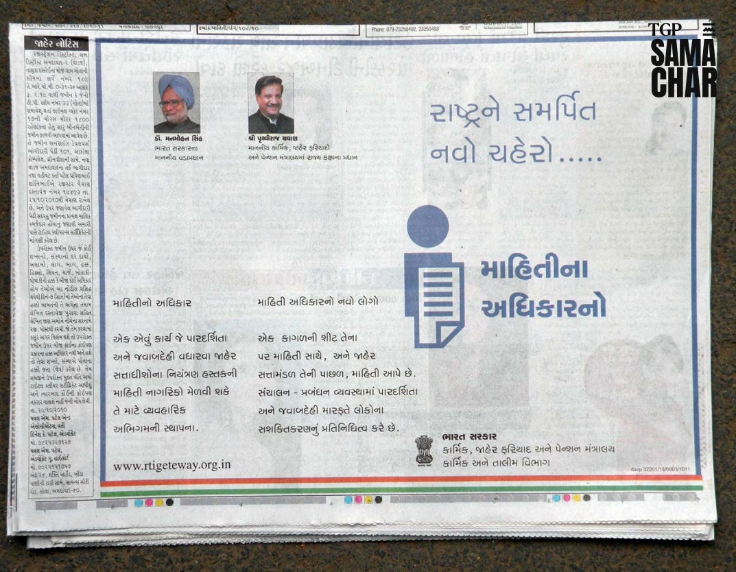
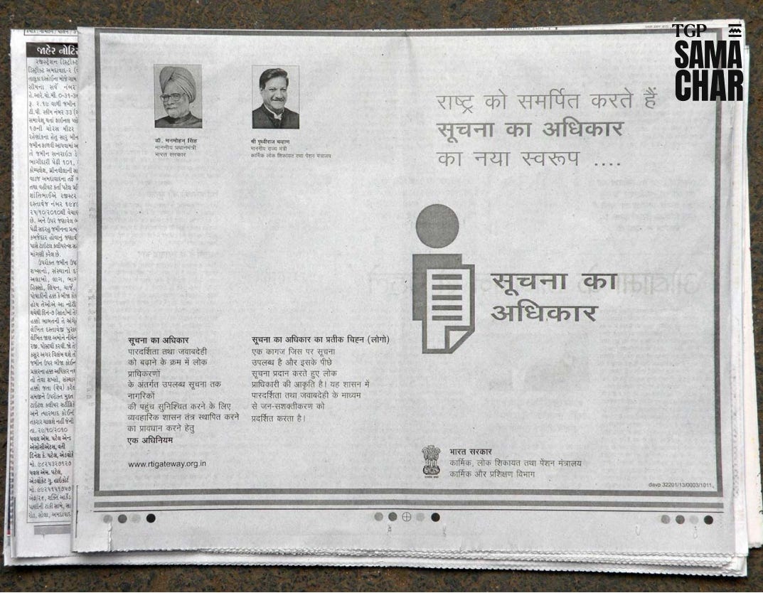
Long Answer: The color had to be consistent (Sobre blue, #6A89A7), even when painted by thousands of local sign painters across rural India, so I chose a commonly available blue. The typeface needed clarity and distinctiveness. Bell Gothic gave the capital “I” a serif, improving recognition across scripts. The design had to reproduce well in different formats and contexts, from stickers to walls, without losing meaning. It also had to avoid an authoritative look, staying approachable yet credible, as per the brief. Finally, we conducted field research and public testing to ensure interpretations matched the intent, avoiding undesirable associations and ensuring the logo connected with citizens everywhere.
Do check Project Pratima - I with few other designers designed an icon library for all financial institutions in India (PCI and RBI initiative)
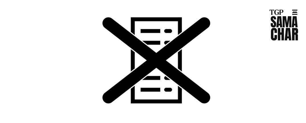
3️⃣ How was it like to design NOTA symbol for ballot paper/EVM?
Short Answer: Paradoxical.
Long Answer: The NOTA option presents a paradox. People take the trouble of voting, but choose "None of the Above." The symbol had to show rejection without disrespecting candidates. We needed to avoid religious or cultural cues and ensure it was instantly understandable for first-time voters. The design would only be seen inside polling booths ( as no one campaigns for NOTA ). So recognition had to happen immediately. To find the final symbol, my team and I explored Indian gestures for "no", studied different cross marks and tested recall from people of various age groups.
Check nuances of Indian symbols - Trinetra by IDC
4️⃣ Apart from designing what is the most important job of a designer?
Short Answer: D2P ( Designer to People )
Long Answer: Most of the designers work with large corporations or government agencies. The symbol they design get used by these firms to approach(or sometimes poach) users. My advice to upcoming designers is to test their design directly with people. Explain your work to your parents, neighbours, or fellow train commuters. Big collaborations start with awareness at the smallest level.
To find out more about Tarun Deep’s work follow his blogs tarunonlife.wordpress.
If you are a designer, here are a few questions to ponder this 🇮🇳 Independence Day:
Have you designed anything (process, space, artefact) outside your job that has made life better for you and those around you?
Have you taken time to explain to non-designers (family, friends, relatives, co-commuters) what design is and what exactly you do?
Have you adapted your work to make it accessible to people from very different backgrounds or with different abilities? How?
What is your personal contribution—no matter how small—to shaping the design landscape of independent India?
Have you done any design work for social impact in India?
If, yes, please share in the comments and I will post it on TGP social handles as case studies / stories by you.
If this Samachar intrigued your design thought consider listening to the complete conversation. Link to the full episode - Spotify || Youtube || TGP Website