Decoding ₹: 4 Nuances of the Rupee Symbol with Uday Kumar
The thoughtful design choices that shaped India’s currency (Rupee) symbol.
The Indian Rupee symbol (₹) recently became controversial during Tamil Nadu's budget session. This reminded me of my talk with its designer, Uday Kumar (featured in Audiogyan Ep.7). Kumar created the ₹ symbol in 2009 through a competition organized by the UPA government under (then Union Minister of State for Finance) S.S. Palanimanickam of DMK. The symbol was officially adopted as India's currency mark on July 15, 2010.
Famously referred to as the designer of the Indian Rupee symbol, Uday Kumar is working as an Associate Professor and Head of the Department of Design, at IIT Guwahati. He has completed his PhD in design at the Industrial Design Centre, IIT Bombay. His special focus is on Tamil typography.
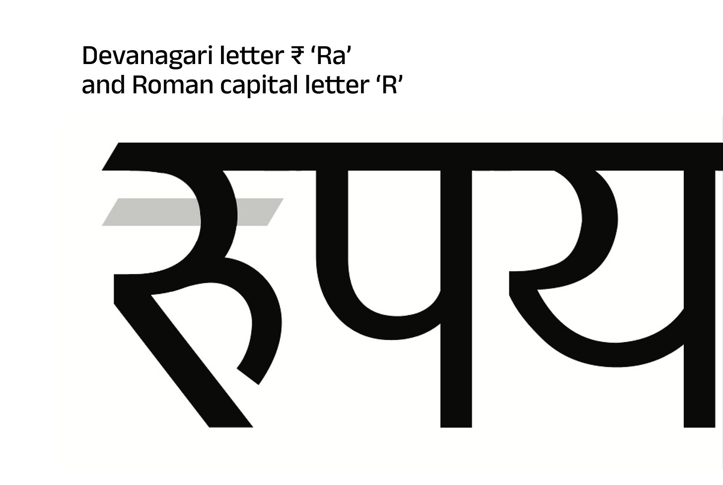
The ₹ symbol masterfully merges Devanagari "र" (Rupaya) with Roman "R" through clean, purposeful typography. This minimalist design bridges India's linguistic heritage with global accessibility. The horizontal line cutting through creates visual balance while the forward-leaning strokes suggest economic momentum. Its simplicity allows for clear reproduction across all media - from digital interfaces to printed currency - demonstrating how thoughtful typographic restraint enables universal recognition and practical scalability across contexts.
The Shiro Rekha (horizontal top line) in the ₹ symbol anchors its distinctly Indian identity. Uday Kumar deliberately chose Devanagari for this unique typographic feature that reads from top-down. This structural element preserves India's linguistic heritage while enabling contemporary application. The seamless integration with Roman elements creates visual continuity that works across all contexts—from handwritten notes to digital displays—embodying both tradition and modernity in a single, efficient mark.
The parallel lines in the ₹ symbol serve dual symbolic functions through thoughtful design economy. They reference both the mathematical equals sign—representing economic balance and fair exchange—and subtly evoke India's tricolor flag. This visual metaphor communicates financial equality while reinforcing national unity that transcends social divisions. The symbol's elegant simplicity allows it to maintain these profound meanings while functioning effectively across all contexts, from official documents to everyday transactions in millions of Indian households.
The ₹ symbol's horizontal strokes create visual harmony with global currency symbols while maintaining its distinctive identity. Uday Kumar's typographic analysis revealed horizontal/vertical strokes as a unifying feature across world currencies—from the dollar's vertical stroke to the euro's horizontals. By incorporating parallel lines, the rupee symbol achieves instant recognition within the international financial language while preserving its uniquely Indian characteristics. This thoughtful design balance exemplifies "global excellence with local relevance," allowing the symbol to function effectively in international markets and local transactions.
“Simplicity can extend the longevity of the design.” - Uday Kumar
While the Rupee's value keeps hitting new lows, Uday Kumar's ₹ symbol remains a rare design high—proof that thoughtful creativity appreciates even when the currency depreciates. The recent political controversy inadvertently spotlights visual problem-solving, reminding us that when politicians go low, designers can still aim high. Perhaps the finance ministry should consider investing more in design thinking—it seems to have better returns than some of its economic policies!
Listen to the full conversation on 👉 Spotify | Substack | Youtube | ApplePodcast


