

4 Truths every Designer must know about Fonts with Mahendra Patel
Explore 4 key lessons on typography and font design from Prof. Mahendra Patel, India’s legendary designer known for shaping modern Indian typefaces.

Why are font designers called authors? I asked Mahendra Patel in episode number 18.
Mahendra Patel is a retired senior faculty member of the National Institute of Design, Ahmedabad, India. Presently, he is a mentor professor at Symbiosis Institute of Design, Pune and mentor consultant at Leaf Design, Mumbai.
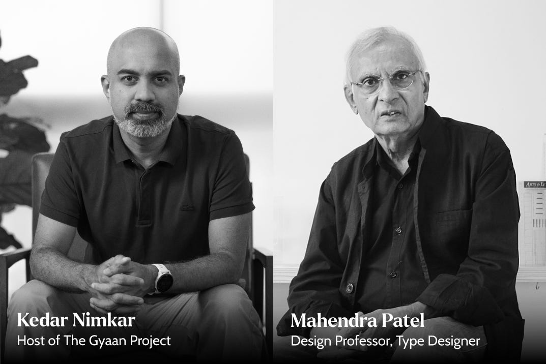
Mahendra Bhai (as many call him) has taught at NID, Ahmedabad for a long 39 years and conducted numerous workshops across various institutes across India, USA, Canada, New Zealand, and Pakistan. In 2010 he was awarded the Gutenberg Prize of the International Gutenberg Society and the City of Mainz for his contribution to typography.
Today’s Samachar has got some practical answers for Designers and non-designers alike. Regarding Font designers called Authors? Well, it’s mainly about respect and pride. More at the end of this SamaChar.

1️⃣ Is Comic Sans really a bad font?
Short answer: If misused.
Long answer: A font has nothing to do with being good or bad. It is we who make it so. If you use Comic Sans appropriately, for example, for children or handwriting or doodle expressions, it works. I always say a font should be decided by its use, technology, subject, and users. That is what typography is about. The right balance between readability and legibility. Serif or classic fonts are more suitable for day-to-day or heavy reading in print. But on computers or screens, the thick and thin strokes of a serif font can get lost because of pixelation, so a mono-line or sans serif font works better. If you enlarge and manage the weight properly, even a serif can work. I can make any font look good with good typography.
How we made the typeface Comic Sans with Vincent Connare, typographer
2️⃣ Do fonts have emotion?
Short answer: Feeling comes with treatment.
Long answer: A font on its own is seen as black and white. When we talk about emotion or expression, it is not only black and white. There is color, size, alignment, use of capitals or lower case, spacing between letters, and spacing between lines. All these things work together to create the intended impact or expression of a typeface. For example, if you use a sans serif in pink, it feels feminine or soft. If you use the same sans serif in bold steel blue, it becomes industrial. Even among sans serifs, some are more human because they follow handwriting flow and readability, while others are geometric and constructed. So, the feeling comes from both design and treatment.
Know more about The Psychology of Fonts.
3️⃣ Helvetica vs Frutiger vs Futura — how do you choose?
Short answer: Depends on the context.
Long answer: Helvetica and similar newer faces were drawn on vertical and horizontal axes. They are more constructed, less written. Frutiger and Verdana bring in humanistic considerations, so they support reading comfort along with clarity. Futura and other early geometric faces focus on graphic construction. So my choices follow use. For an architect’s building, Futura or a geometric form may fit the visual idea. For a short sign, Helvetica is fine because there are only a few words. For a research paper or a whole city’s signage system, I would go to Frutiger, because it supports many kinds of readers every day. Context, comfort, and intended duration matter. Anything used appropriately can be good, but purpose leads the selection.
Typewolf has been my go to place for Typography. What’s yours? let me know in the comments below.
4️⃣ How do you build hierarchy and pair serif with sans?
Short answer: With trained eyes.
Long answer: It depends on how much differentiation or hierarchy you want to give. If you want a subtle, sophisticated difference, then typographically make it bold, larger, or change the color but keep the same font. If you want further distinction, then go for capitalisation or small caps. When that is still not enough, you can contrast Serif with Sans Serif, or Sans Serif with Serif. There is also something called text gray—when you look at a text column, you feel a certain texture or luster. Some letters, because of their contrast or treatment, look harsh, while some feel smooth. It depends on what texture is pleasing to the eye or suits your text. That can be controlled by using color or tone instead of just black. Typography is different from type design. Letterforms are only raw material; rhythm, balance, and contrast come from typographic decisions
Fontpair is an amazing resource for all Designers.
I hope these questions and answers are interesting and helpful. If you wish to listen to more details, here are links to the full 38 minutes conversation and it’s transcript. Youtube | TGP Website | Spotify | Apple Podcast
The question I began this SamaChar was, Why are font designer called Authors?
Before computers came, it was only hot metal. To design a type and make the master matrices and cast them in particular sizes would take two to three years. It required a lot of precision, mechanical and hand skill, and even metallurgy because it involved casting and cutting. It was a very skilful job, more than just design. The ownership was very high and people like Baskerville, Garamond, Bodoni were proud to have their own fonts, printers, or foundries. These couldn’t be copied easily. Then, with phototypesetting, things became easier; you drew instead of cutting, but it still needed optical understanding and correction. Computers changed everything. With Fontographer and FontLab, drawing became very precise and accessible. People revise old fonts and name them with legends out of respect. Authorship is different today, but the idea of designing a voice remains.
If you’ve enjoyed today’s SamaChar, please do consider sharing and spread the word in your network. The Gyaan Project is labour of love since 2016 and trying to document creative wisdom. I would also love to know your feedback and thought in the comments below.
If you are interested in Typography, Calligraphy, Type design, I have created a playlist. Do check it out.