Summary
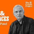
In this episode of The Gyaan Project, Prof. Mahendra Patel, India’s legendary type designer and design educator, shares deep insights on typography, readability, and the emotion behind fonts. From Comic Sans to Helvetica and Frutiger, he explains how context defines good design. A must-listen for designers, students, and anyone curious about how fonts shape perception and communication.
Topics discussed in the episode
What is the difference between a font, a typeface, and a font family?
Why do new styles like semi-serif or decorative fonts keep emerging?
Is Comic Sans really a bad font? How can one judge a good or bad font?
Do fonts have emotion or personality of their own? How can one identify that?
How should one choose between Helvetica, Frutiger, and Futura?
What practical process can help a designer pick the right font for reading or display?
Why are font designers called authors, and how has that evolved with technology?
How did Indian type design evolve, and what were some milestones in its journey?
Why does mathematically correct spacing look visually wrong, and how do you fix it?
How can one build hierarchy and pair serif with sans serif typefaces effectively?
Reference links
https://www.typeoff.de/2010/07/mahendra-patel-lecture-in-mainz/
https://gazette.universalthirst.com/home/mahendra-patel-a-60-year-journey-of-design-in-india
https://www.designindia.net/thoughts/people/teachers/prof_mahendra_patel
https://www.linkedin.com/in/mahendra-patel-b8085810/?originalSubdomain=in
https://en.wikipedia.org/wiki/Mahendra_Patel_(typeface_designer)
https://titumililetterpress.wordpress.com/2014/03/04/typo-guru-mahendra-c-patel/
https://www.thegyaanproject.com/p/4-lessons-on-typography-from-mahendra
If you are interested in Typography, Calligraphy, Type design, I have created a playlist. Do check it out.


